Friday 30 September 2011

Tip #89: When a final cut... is not so final

By Dan Parkes (Director/editor)

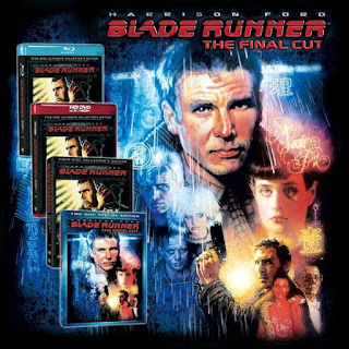
The word 'cut' is used during editing and distribution to refer to different versions of the film. Sometimes a film can have many different 'cuts' - Blade Runner famously has seven different versions of the film, including an "International Cut", the "Director's Cut" and the "Final Cut". The key difference being the removal of Harrison Ford's voice over.

But what are the differences in definition between each 'cut'? And how can we apply this to low budget filmmaking?
Here are eleven possible versions and their definitions:
  1. Workprint cuts: These are the first cut, second cut, third cut and so on that the director and editor work on. A later "workprint" cut might be shown to a test audience, but otherwise these are never normally seen publicly.
  2. Final cut: The finished version of the film as decided by the producers. (although now more synonymous with a certain Apple editing tool!)
  3. Theatrical cut. This is the version of the film shown in cinemas
  4. International cut. From the perspective of the US, a "domestic" cut means within the United States, but if for some reason a different version is required for overseas this may be referred to as an "international" cut.
  5. Distribution cut DVD/Blu-ray. Once it has finished its theatrical run then when it is released to the domestic market changes might be made -previously there were "pan-and-scan" and "widescreen versions" to accommodate the fact that not everyone had widescreen TVs.
  6. Censored/uncensored cut. Depending on individual territories and also classification guidelines and rulings, different versions
  7. TV cut. Special versions for broadcast will also be different -maybe with offensive language or scenes edited and the pacing and end credits shorted so that it fits within a certain time slot.
  8. Airline cut. There are separate versions that are altered just for airline audiences, with length and suitable content considerations. It also often involves being altered to fit the screen sizes on most airplanes.
  9. Directors Cut. If there were creative differences with the studios sometimes the director will release their original version, for better or worse!
  10. Extended cut. Maybe similar to the above, but since not all director's cuts are longer (Peter Weir's cut of his own "Picnic at Hanging Rock" is shorter)
  11. Digitally Remastered. If only on celluloid and in need or repair a new digital version, with restoration, may also be released.
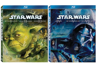
Of course the invention of DVDs and Blu-ray has now made it a lot easier to be able to add the different versions and endings, even providing opportunities for studios to rerelease films as part of a long-term marketing strategy (e.g. the 10th anniversary extended version). A good (or bad!) example of constant tinkering with various cuts and new editions is George Lucas' Star Wars saga.

However you are probably thinking that it is highly unlikely that a low budget feature will ever get to have so many cuts made to it. And you are probably right -unless your film becomes phenomenally successful then it will hardly merit the attention of being recut and rebranded. But the methodology here is important, as you can use the same form of analysis to ensure that the final cut is the best cut.

Here are some things to think about, especially during the work print cuts:
  1. Logic -Does it make sense? Does it require something more, or maybe something less, to tell the story?
  2. Pace -Are there times when it feels too long and the audience may begin to loose interest, or other scenes or cuts that are too fast. Is each and every scene necessary? Could a scene or two be dropped without affecting the story but maintaining the pace?
  3. Continuity -is there something distracting from the story
  4. Style -Is the editing, the colour grading, the look and feel of the film correct, or does it require further polishing?
  5. Music/Audio mix. Does the music work, hinting at the emotional core, not being too overbearing. Are extra the sound effects required to add an extra layer of realism.
  6. Effects shots. Are the effects shots working or are they drawing undue attention to themselves? Is there anything else to be tidied up or removed?
  7. Mistakes -titles/credits. Are there any spelling mistakes, or omissions?
And what about Ambleton Delight? Well it went through half a dozen working cuts before having three major versions released: a premiere cut (the longest version), a festival cut (tightened version, with one scene removed) and a distribution cut (with one shot removed and a new ending, the shortest of the three cuts). The Blu-ray version is the same as the DVD (distribution cut) except that it contains the cut scenes and the full making of.

Tuesday 27 September 2011

Tip #88: Get permission to include logos and artwork

By Dan Parkes (Director/editor)

It is the easiest mistake in the book, and we fell into it big time - allowing a copyrighted logo, brand or artwork to appear without permission. In our case it was a scene involving a father-and-son bonding moment, during the filming of which all our energies were focused on trying to ensure the young child would appear natural in front of camera, to the extent of overlooking the obvious: that the young boy was wearing pyjamas with a huge picture of TinTin on them! In the end the child was more than natural on camera, providing us with lots more footage than was originally scripted. The producers, notably Sinead Ferguson, on seeing how obvious the TinTin image was, questioned what the situation would be regarding clearance. With the upcoming film by Steven Spielberg on its way, we thought this might be an impossible task...

Actors Jos Lawton and Henry Page
in the 'TinTin' scene.

And it was not the first brand or logo that we had to attempt to get clearance for. Although some great efforts were made to avoid certain logos and branding in shot -either by turning the labels round or removing them completely from shot, or blurring them out by using depth-of-field in the lens- there were several companies we had to approach to get clearance, and who are consequently mentioned in the end credits.

But in some cases we knew it would be impossible. For example, there is a flashback party scene with implied drug usage, which has beer cans scattered around the room. We knew that it would be very unlikely to get permission to use a brand name in such a scene. So in the end we digitally removed the offending logos. It was not an easy task. In fact it is probably the most complex effect shot in the film. But hopefully not one that anyone notices!


The lesson here is:
  • Don't include famous logos, labels, branding or artwork on props or set design without getting permission first
  • If you need to include a logo and don't think you can afford or even get permission, then create an alternative version that will not be subjected to copyright
  • If uncleared labels appear in shot during filming and cannot be removed or changed, turn them around, reframe the shot, or use depth-of-field to obscure them.
  • Avoid having to digitally remove or alter labels and logos in post -it is a gruelling and sometimes unsuccessful task!
And of course another option is to not only get permission first, but use it as a funding opportunity....more about that here.

And what about TinTin? Well fortunately it has a happy ending. Producer Sinead Ferguson was able to heroically get contractual permission to include the logo direct from Herve Moulinsart who are the owners of the TinTin artwork. And so it remains one of our favourite moments in the film, for more than one reason!

Friday 23 September 2011

Tip #87: 12 Essential FREE video production software!

By Dan Parkes (Director/editor)

Film making can be an costly exercise, but that doesn't mean everything has to be expensive. Seeing that this is our 100th post to celebrate we are listing 12 of what we think are worth having as part of your arsenal.

Click the image to go to the official website:

1. Celtx -free production software. They have recently introduced paid subscription for using its collaborative features, but if you use it in conjunction with something like DropBox you can still use it to collaborate (although it may not be as easy).


2. Dropbox An excellent collaborative tool -meaning you can instantly share files via a common folder. The free version allows up to 2GB.


3. Muvizu If you need to some 3D previsualisation for effects shots or complicated sequences, Muvizu is free software that enables users to make 3D animations.


4. Lightworks A video editing software package that was used on the film The Kings Speech and is now open source, meaning you can download a free version of it. Looks like it has some great features. It does require 'Matrox VFW' codecs and a recent version of Apple Quicktime and is compatible with Windows XP, Windows Vista, Windows 7 32 bit and Windows 7 64 bit.

5. VLC A free open source media player which seems to play just about anything and everything! Can also be used to convert between formats and works on most platforms, Windows and Mac.

6. StarBurn (Rocket Division Software) Free CD burning, DVD burning, Blu-Ray Burning software.

7. ImgBurn A lightweight CD/DVD/HDDVD/Blu-ray burning application that enables you to burn disc images with ease. We recommend using Imgburn has a better workflow for burning multiple discs as it is faster and has verification features.

8. VisualSubSync A subtitle program that facilitates subtitle synchronization by showing you the audio form. For more information on how we used it check HERE.


9. Subtitle Workshop Free subtitle software which is good for converting subtitle formats and also translation. For more information on how we used it check HERE.

10. VirtualDub VirtualDub is a video capture/processing utility for 32-bit and 64-bit Windows platforms (98/ME/NT4/2000/XP/Vista/7). We use it to help create burned in subtitles. For more information on how we used it check HERE.

11. NVU Webpage design software that we use to create the official website. For more information on how we did that check HERE.

12. FreeFilesync An Open-Source folder comparison and synchronization tool. It is optimized for highest performance and usability without restricted or overloaded UI interfaces. A great and free method of backing up files over multiple discs or computers, especially if you cannot afford expensive backup systems such as Raid.

Note: The software was free at the time of writing. Any updates to links or additional information please comment below.

Tuesday 20 September 2011

Tip #86: Social networking -does it work?


By Dan Parkes (Director/editor)

Social networking, a new inexpensive means of promoting your film, has seemingly become an important part of any marketing strategy.

Kevin Smith famously used MySpace in 2006 to promote his Clerks II by putting the names of the film’s first 10,000 MySpace friends in the credits. Since Smith had 50,000 friends at the time this wasn't going to be a problem. They had the names in two hours. Clerks II apparently made a profit and now Kevin Smith has nearly two million Twitter followers.

But does it work? It is a well known fact that a film can sink or swim based purely on rumour and gossip alone. So on-line marketing via social networks is certainly one way of making a presence -and most importantly for budget filmmakers -one that can theoretically be done for free. And it must also be noted that a film is more likely to garner the attention of buyers and distributors if it has a strong on-line following.

In addition to an official website (for more information on that check our previous blog), here are the four main avenues to think about trying:

1. Facebook Page
It's a necessary evil. And very easy to set up, the important thing is to keep it regularly updated and to look not too much like it is advertising the film all the time. Post other interesting things as well.

2. Twitter
Another necessary evil! But again very easy to set up. You could have regular tweets with real time information on the production progress, promote special contests, sneak previews and have links to your other sources of on-line presence such as Facebook. But there is a danger...negative, abusive or downright stupid "tweets" could embarrass and endanger your cast and crew not to mention the film itself.

3. Blogger
Not so necessary, but an opportunity to go into more detail than Facebook or Twitter will allow. This can also be more practical -such as this blog -with anecdotes and behind-the-scenes information or a production diary. Updates to the blog can then be posted on Facebook and Twitter.

4. YouTube
Again, not completely necessary, but once you start releasing any video material this is a good place to host it for free. You could put up a production diary, making of and trailers, which you then embed into your blog and official website.

5. Newsletters/E-mails
Collecting e-mail addresses of those interested in the film and keeping them updated is also a good idea. We use the brilliant (and free) on-line e-mail marketing tool MailChimp which helps you create and maintain subscription lists, design newsletters and e-mails, send the e-mails and provides comprehensive reports on how many of your newsletters are being opened and what links are clicked.

At the end of the day though, an excellent marketing campaign for a bad film.... still makes it a bad film. So make sure you make a good film first.

If you have any good social networking and marketing ideas please post them below.

Friday 16 September 2011

Tip #85: Build an official website

By Dan Parkes (Director/editor)

Setting up your own official film website, such as we did (www.ambletondelight.co.uk) does not need to be a difficult and expensive option these days. Not only does it mean you have your own place on the web that you can advertise on your film trailers and posters, but it also gives you much better sounding e-mail addresses!

It is essentially a simple 5 step system:

1. Register a domain name
Obviously this will be the name of your film or a variation of it, followed by .com or .co.uk etc. Keep it short and simple -if your film title is already taken you can try just adding the word "movie" or "film". Most domain names can be bought for a year or more, and many companies can offer both the domain name and the hosting as a combined package. Note: Register the domain name as early as possible to avoid being scammed and be careful of any subsequent offers to continue or buy the domain name -they may also be a scam.

2. Choose a hosting package
Now that you have a domain name (i.e. a website address) you now have to organise the hosting -which is the allocation of space on a web server to put your website, and also how much bandwidth is allowed (every time someone visits the site it means data is downloaded from the server - there may be a limit imposed on how much a month is allowed to be downloaded).

3. Design a site
You can actually download free website templates, or buy more professional versions that only need the text and images changed. This is a much faster and professional way of getting a website on-line. We use the free html design software Nvu (http://www.nvu.com/) but there are many out there worth checking. Make sure it is WYSIWYG (What You See Is What You Get) as that is much easier for beginner web designers!

You can also add some great little tools such as Wibiya which includes links to your twitter, facebook feeds and can also create a custom contact page, and a button that translates the entire page into several different languages!

4. Upload
If you are constantly uploading and updating your website you might want to also look at Ftp software which will make this a lot easier. You can use your own computer's operating system to do this or use separate software which can be easier. We use Wise-ftp, but there are many other free alternative ftp programs out there worth trying.

Above: the homepage to our official website
is designed to reflect village life.

5. Check
It is a good idea once you have your website set up to test it on different browsers and different computers including smart phones to see how it looks and if there are any critical compatibility issues. Also check that your new e-mail addresses are up and running and if you have put a redirection to another address in place that it is working correctly.

Tuesday 13 September 2011

Tip #84: Opening and closing credits

By Dan Parkes (Director/editor)

Up until the 1970s most films would begin with the full cast and crew credits list. Now, the full list almost always run as a long scroll at the end of the film. These opening or closing credits should not be underestimated -not only are they an informative and in many cases a contractual requirement, but they can also be an opportunity for creativity.

1. Opening credits/title sequences
Some films such as James Bond and the Pink Panther series have utilised the opening credits as an opportunity for artistic "title sequences", something which has become almost a staple of television openers. But most films have now reduced the number of opening credits down to the bare minimum, often superimposing the text upon the film's opening scenes. The 1993 film The Fugitive has credits appearing fifteen minutes into the film! This is not a necessity however. Some other films such as The Godfather, and the recent Batman Begins (2005) and The Dark Knight (2008) have no opening credits at all, except for the film's title. Apparently, Clint Eastwood has not used any opening credits other than the film's title for every film he has directed since 1982.

For some ideas on how to come up with some interesting and artistic opening title sequences, check these wonderful websites out:

www.artofthetitle.com
http://annyas.com

Above: The opening credits to Forrest Gump,
an example of credits overlaying the action.

Above: The opening credits to Catch Me If You Can,
an example of a creative title sequence.

2. End credit crawl/roll
The longest end credits at the time of writing is in the film Aliens Vs Predator (2004) which run at 12 minutes long, followed by Lord of the Rings: Return of the King at 9.5 minutes. This is of course the time to credit everyone who appears, or was involved in the making of the film. It does not necessarily mean everyone seen in a film must be credited - normally only speaking roles are given credit, but this can depend on the individual contract.


This is also an opportunity for some fun, whether it be to have a great selection of music, a suite from the orchestral score, or to screen bloopers, or post-credit scenes. For example, Super8 (2011), has a film within the film playing during the credits. For more examples check the "Crazy Credits" section on most IMDB film listings or http://aftercredits.com/.

3. Standards -formats etc
In the US, credits are often dictated by the relevant guilds. For example, The Writers Guild of America allows only three writing credits on a feature film, while The Directors Guild of America permits a film to list only one director, leading to some occasional issues, such as when George Lucas resigned from the Directors Guild of America after being fined $250,000 for not crediting the director during the opening title sequence of his film Star Wars!

The BBC also has some credit guidelines for television broadcast, which you can check here.

4. Some tips
  • It is good to start collating credit information from beginning -as the number of thank yous you might accidentally forget is surprising.
  • An official credit list can be used in the press kit and IMDB listing
  • Check for errors -make sure you get the spelling of people's names correct, and check contracts as some actors insist on their name being represented in a certain way.
  • Make sure the font is large enough to read and is not too fast, and is also in keeping with the genre and production design.
You can view the credit list for Ambleton Delight in our press kit, found here.

Friday 9 September 2011

Tip #83: Make a teaser/trailer

By Dan Parkes (Director/editor)

Film trailers have become an artform in themselves, with slick editing, dramatic music and flashy 3D graphics, along with a barrage of impressive imagery and a complete retelling of all major plot points. But the power of a good film trailer should not be underestimated, as a successful trailer will make you really want to watch the film and form a very important part of a marketing strategy.

Of course you don't want to fall into the trap of creating a trailer full of cliches, although there are times when this can be very entertaining -check out the fantastic analysis of trailer techniques in the brilliant trailer for The Hitchhiker's Guide to the Galaxy, with voice over by England's national treasure, Stephen Fry:


When making your own trailer there are some important factors that are good to remember:
  1. A "teaser" is normally shorter than a trailer - and only teases you with limited information/imagery from the film. These are often released earlier in production, before the final edit is complete.
  2. Standard trailers are almost always about 2 and half minutes in length.
  3. Send the right message -don't deceive you audiences unintentionally -if it is an action film show lots of action, if it's a romance, romance!
  4. Use of appropriate music is important -there are some great orchestral trailer tracks you can acquire, or use band music to set a different feel. Of course clear whatever music you use.
  5. Make sure the editing is as slick and professional as possible, with good grading and sound quality -people will judge the quality of the entire film based on what they see in your trailer.
  6. Unless you intend on releasing a "red band" trailer keep everything PG.
  7. Voice over can add an extra dimension, but don't fall into the trap of thinking you need a deep, booming trailer voice... although you can get these done for you if you think it will work (check this guy out: http://www.voiceoverguy.co.uk/)
  8. Add taglines, graphics, festival information or reviews if possible or appropriate.
  9. It is good to finish with some end credits (cast/crew), as seen on the film poster.
  10. The final image you show in the trailer might be the one people remember the most -make sure it is a good one, and makes you want to see what happens next.
  11. Watch lots of other trailers to get familiar with what works best. Here's a good place: http://www.davestrailerpage.co.uk
  12. Release HD (1080p and 720p) versions of your trailers.
For more information and an interesting analysis of making trailers check this article here.

For Ambleton Delight we created a teaser and two trailers. Check them out below (they are all available in HD, just push play, change 360p to 720p and click the full screen button):

Teaser/trailer 1 (before the main production edit had begun):


Trailer 2 (made for the festival circuit):


Trailer 3 (final, official trailer):

Tuesday 6 September 2011

Tip #82: Create a film poster

By Dan Parkes (Director/editor)

Once you have your basic film title logo sorted (refer to previous blog) then the next natural progression is to develop this into a film poster. It is good to do this as early on in the production as it can create a sense of unity and focus for production design. But ultimately remember that it is an advertisement to help "sell" your film so should indicate the mood and genre of your film in an appealing way.

Early concept poster for 'Ambleton Delight'

The early versions of the Ambleton Delight film poster reflected the state of casting at the time and how the main cast might look together. Being a drama set in an English village, the design centered round the main characters and the countryside in the background and this basic concept remained until the final official poster.

A later example of the concept poster for 'Ambleton Delight'.

Here are some elements to think of in your poster:
  1. The main title/logo should be large and bold enough to catch the eye.
  2. It should list some of the main cast -although this is not mandatory. But if you have a "named" actor then their contract may stipulate "top billing" meaning their name should feature prominently above the rest.
  3. If your film has a "tagline" or phrase that might catch people's attention this is the place to use it. For example with Ambleton Delight our tagline is a sarcastic expression taken from a line of dialogue in the film: "Experience the delights of the countryside."
  4. Cast/crew credits. Normally this is located in the lower portion of the poster and in small print. A tall type font works best. There are some free replica fonts you can download to imitate the official font used in Hollywood here: http://www.dafont.com/sf-movie-poster.font
  5. Festival selection/nomination/awards. If your film has festival information worth listing you can use the laurel leaf to list this. Here is a template you can use: http://www.sonnyboo.com/downloads/images/Film_Festival_Laurel_Leaves.png
  6. Film critics quotation. If your film has been reviewed then these are definitely good to include. In the case of Ambleton we included a quotation from a film festival.
  7. You should create both a portrait and landscape ("quad") version -the landscape version can also become a desktop wallpaper.
  8. Overall, does the poster make people want to see it? Does it look professional enough?
Final version of 'Ambleton Delight' poster, here seen as a"quad" or landscape version.

For some great tips and examples check this link: http://www.webdesignerdepot.com/2011/02/7-elements-of-a-great-movie-poster-design/

Here are some classic designs for inspiration....


Friday 2 September 2011

Tip #81: Design a film logo

By Dan Parkes
(Director/editor)


Creating a film logo is an important aspect of the branding and marketing of any film. Once the name of the film has been established beyond a working title then selecting a suitable font and look is important, as this may dictate such things as the look of the opening titles and closing credits, the film poster, website and DVD wrap and menu artwork.

It does not have to be as complex as you may think. Some film title artwork is very basic -simply the choice of a suitable font. Others can also include subtle imagery, such as the puppet hand in The Godfather title. Or you can use badges or crests or use 3D art work to create depth. And don't forget the importance of colour - the colour could end up becoming a means of branding the entire film. Just make sure your design does not lead viewers to think the film is of a certain genre that it isn't.


In the case of Ambleton Delight, since the word 'Ambleton' is ficticious we decided to create it in the look of a village sign, indicating that it is in fact the name of the village.


For inspiration, notice how these recent film logos indicate the nature/genre of the film and become an important part of the branding:


Here are two excellent websites to get further inspiration and information:

http://annyas.com/screenshots/
http://www.thedesignbuzz.net/27-movie-logos/